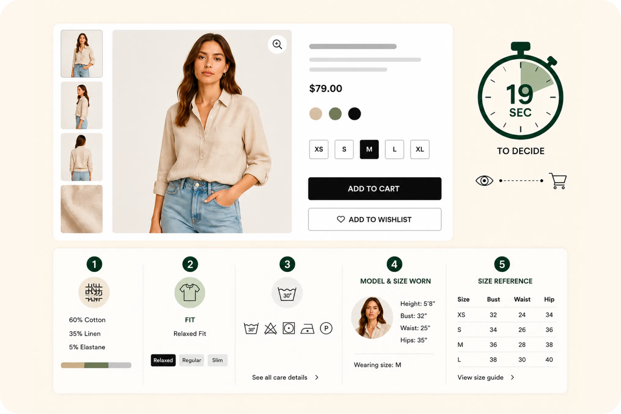
Nineteen seconds. That is roughly how long the average shopper takes to make a brand purchase decision online, according to Nielsen. The majority make it in under ten. Whatever your product page is going to say to a buyer, it has to say it in about the time it takes to read this sentence twice.
Most fashion product pages are not built for that reality. They are built as though the shopper will arrive, settle in, and read. So the important facts get written into a paragraph halfway down the page, where the shopper, who is scanning and deciding in seconds, never sees them. This is a piece about what those seconds are actually spent on, and what a fashion product page should put in front of the buyer before the window closes.
What the 19-second number actually measured
The figure comes from Nielsen, in a 2015 article built on research from the Ehrenberg-Bass Institute. The study looked at how long people spend choosing a brand at the moment of purchase. In-store, the average was about 13 seconds. Online, it was about 19 seconds, with the majority of decisions made in under 10.
It is worth being precise about what this does and does not say. It is not a claim that shoppers spend only 19 seconds on your entire site, and it is not a stopwatch on every visit. It describes the brand-choice moment, the instant where attention converts into a decision. The honest takeaway is not the exact number but the order of magnitude: the deciding window is measured in seconds, not minutes, and a product page that assumes otherwise is designing for a shopper who does not exist.
The description graveyard
Walk through a typical fashion product page and you will find a block of descriptive copy: a sentence about the design inspiration, a line about the fabric, the fit, maybe the care, all woven into a tidy paragraph. It reads well. It also goes almost entirely unread.
Nielsen Norman Group’s eye-tracking research is the reason. People do not read web pages, they scan them, in an F-shaped pattern that hugs the top and the left and skips dense text. NN/g concluded that on an average page users have time to read at most about 28 percent of the words, and that 20 percent is the more realistic figure. So the fabric content a shopper genuinely wants, sitting in the third sentence of a paragraph, has roughly a one-in-five chance of being seen at all. The description is not wrong. It is just the wrong container for facts that need to be found fast.
Scanning beats reading, so design for scanning
The fix is not to write better paragraphs. It is to stop putting deciding facts in paragraphs. A fact rendered as a labeled block, a badge, a bar, or an icon is caught in the scan. A fact written into a sentence is caught only if the shopper chooses to read, and mostly they do not.
This is why a fabric composition bar outperforms the same information written as text, why a fit badge outperforms a sentence about fit, and why a row of care icons outperforms a line that says machine wash cold. None of these carry more information than the prose version. They are simply in a form the eye registers without the shopper having to commit to reading. In a 19-second window, that difference is the whole game.
What good fashion pages put in the window
Compare a strong direct-to-consumer fashion page with an average one and the difference is rarely the photography, which is usually good in both. The difference is what sits near the top, in the scannable zone, versus what is buried below.
A strong page surfaces the deciding facts immediately and visibly. An average page leads with a name, a price, and a size dropdown, then hides everything else in a description and a collapsed tab the shopper never opens. Same information, often. Completely different odds of it being seen. The research group Baymard has found that 90 percent of apparel sites fail to give shoppers enough information to properly assess a product, and a large part of that failure is not missing information, it is information placed where nobody looks.
The five things a fashion shopper needs in 19 seconds
For fashion specifically, the deciding facts are consistent. Put these five where they are scanned, not where they are read.
1. Fabric. What the garment is made of, ideally as a visible composition rather than a buried line. It is the first quality signal a shopper looks for.
2. Fit. Slim, regular, relaxed, oversized. One badge answers a question the shopper would otherwise have to infer from the photos.
3. Care. How to look after it, shown as care icons rather than a sentence. It matters more for higher-value pieces, where “how do I keep this alive” is part of the buying decision.
4. Model and size worn. The model’s measurements and the size they are wearing, so the shopper can map that body onto their own. “Model is wearing M” alone does not do this.
5. Size reference. A size guide that fits the garment type, easy to reach from the buying zone rather than hidden three clicks away. For some garments, such as classic sarees, the right reference is length and drape information rather than a size chart at all.
Putting these five in scannable form is the entire job, and it is the job StyleImprint exists to do, turning the facts already in your catalog into visual blocks near the top of the page. But the principle stands whether you use an app or build it by hand: the deciding facts belong in the scan, not in the prose.
The short version
The deciding window is measured in seconds. Shoppers scan rather than read and catch perhaps a fifth of the words on a page. So the facts that decide a fashion purchase, fabric, fit, care, model and size worn, and a size reference, cannot live in a description paragraph. They have to be visible at a glance, near the top, in a form the eye registers without reading. Men’s clothing stores on Shopify convert at around 0.8 percent and women’s at around 3.6 percent. The product page, and specifically what it shows in the first few seconds, is where a lot of that number is decided.
Frequently Asked Questions
How long do shoppers spend deciding on a product online?
Nielsen reported that the average consumer spends about 19 seconds making a brand purchase decision online, and that the majority spend less than 10 seconds. The in-store figure was about 13 seconds. The number describes the brand-choice moment, not total time on a site, so treat it as a signal of how little attention each product page gets rather than a literal stopwatch on every visit.
Why don't customers read product descriptions?
Because people scan rather than read online. Nielsen Norman Group's eye-tracking research found an F-shaped reading pattern and concluded that users read at most about 20 to 28 percent of the words on an average page. A long paragraph of product copy is mostly skipped, so the key facts have to be visible at a glance, not buried in prose.
What information should be above the fold on a fashion product page?
The five facts a fashion shopper needs to decide: fabric, fit, care, the model's measurements with the size worn, and the size guide. Shown as scannable blocks near the top, these answer the buyer's real questions inside the short attention window rather than forcing them to read a description that they will skip.
Does a faster product page decision mean higher conversion?
Not automatically, but the logic is straightforward: if shoppers decide in seconds and scan rather than read, a page that surfaces the deciding facts quickly gives the buyer what they need before they lose interest. It removes friction rather than guaranteeing a sale, and removing friction is what product-page work is for.