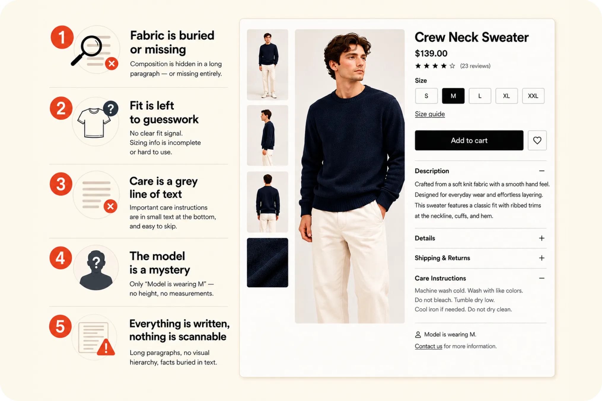
There is a number that should bother anyone selling clothing online. The Baymard Institute, a UX research group that has studied ecommerce usability for over a decade, found that 90 percent of apparel sites fail to enable users to properly assess the appearance, size, or fit of their products. Not 90 percent of bad sites. Ninety percent of apparel sites, full stop.
This is not a story about broken pages or ugly design. The photography on most of these stores is good. The problem is quieter and more expensive: shoppers cannot confidently judge whether an item is right for them, and an uncertain shopper does not buy. This post is the map of where that failure actually happens, the five things most fashion product pages still get wrong in 2026, and where to fix each one.
What the 90 percent actually measures
It is worth being precise. Baymard’s finding is about assessment: can the shopper, working only from the page, accurately judge appearance, size, and fit. When 90 percent of sites fail at least one part of that, it means nine in ten apparel pages leave the buyer guessing about something that matters to the purchase. Baymard’s wider 2026 work is consistent with this, reporting that up to 62 percent of leading ecommerce sites have mediocre or worse product-page UX, and that 43 percent of benchmarked sites either provide no usable sizing information or none at all.
The reason this matters commercially is conversion. Shopify’s fashion data for 2026 puts men’s clothing stores at around 0.8 percent conversion and women’s at around 3.6 percent. Those numbers are shaped by many things, but the product page, and specifically whether it answers the shopper’s questions before they lose patience, is one of the few levers a store fully controls. The Baymard 90 percent and the conversion rate are describing the same gap from two directions.
The five things most fashion product pages get wrong
Across fashion stores the same five failures recur. Here they are, each with where it gets fixed.
1. Fabric is buried or missing. The first quality signal a shopper looks for is usually written into a sentence halfway down the description, or left out entirely. It should be structured data shown as a clear block, ideally a composition bar. The full fix is in how to display fabric composition on Shopify.
2. Fit is left to guesswork. Slim, regular, relaxed, oversized: a single fit signal answers a question the shopper otherwise has to infer from photos. Sizing is the sharpest version of this problem, and it is exactly where Baymard found 43 percent of sites failing to give usable information.
3. Care is a grey line of text. “Machine wash cold, tumble dry low” sits at the bottom of the page and gets skipped, even though for higher-value pieces care is part of the buying decision. Shown as icons it is scanned instead of ignored. See the guide to ISO 3758 care symbols.
4. The model is a mystery. Baymard’s testing is blunt that apparel needs a human model to be judged properly, and that 21 percent of sites do not even show one. Most that do stop at “model is wearing M,” which tells the shopper nothing about whether it will fit them. The fix is a model strip with height and measurements, covered in how to show model measurements.
5. Everything is written, nothing is scannable. Even when the facts are present, they are trapped in prose. Shoppers scan and decide in seconds, so a paragraph is the wrong container for a deciding fact. This is the thread running through the other four, explored in the 19-second decision.
The pattern underneath all five
Look at the five together and the common cause is obvious. None of them is a photography problem or a pricing problem. Every one is an information problem, and more precisely a problem of structure and placement. The facts that decide a fashion purchase are either missing, or unstructured, or buried where a scanning shopper never sees them. That is the whole of the Baymard 90 percent, restated in practical terms.
Which points to the fix. A fashion product page needs a dedicated place where the deciding facts, fabric, fit, care, the model, and size, live as scannable visual blocks near the top, instead of being scattered through a description and a stack of collapsed tabs. That is the idea behind a visual meta box for fashion: one consistent, scannable summary of everything a shopper needs to assess the item, on every product page. Whether you build it by hand or use a tool, the principle is the structure, not the software.
The short version
Ninety percent of apparel sites fail to let shoppers properly assess appearance, size, or fit, and that failure shows up as five recurring gaps: fabric buried, fit left to guesswork, care ignored, the model a mystery, and everything written instead of scannable. None of it is about better photos. It is about getting the deciding facts structured and placed where a shopper who decides in seconds will actually see them. Fix those five, and you are no longer in the ninety percent.
Frequently Asked Questions
What do most fashion product pages get wrong?
Five things recur: fabric is buried in the description or missing, fit is left to guesswork, care is a grey line of text nobody reads, the model has no stated measurements, and the deciding facts are written as prose instead of shown as scannable blocks. Baymard found 90 percent of apparel sites fail to let shoppers properly assess appearance, size, or fit, and these five are how that failure usually shows up.
What does the Baymard 90% statistic mean?
The Baymard Institute, a UX research group, found that 90 percent of apparel ecommerce sites fail to enable users to properly assess the appearance, size, or fit of their products. It does not mean the sites are broken; it means shoppers cannot confidently judge whether an item is right for them, which is the moment a purchase is won or lost.
What are the best practices for a fashion product page?
Show the deciding facts clearly and near the top: fabric composition, fit, care, the model's measurements with the size worn, and a size reference suited to the garment. Present them as scannable visual blocks rather than buried in a description, since shoppers scan rather than read and decide in seconds.
Why do men's fashion stores convert lower than women's?
Shopify fashion data for 2026 puts men's clothing conversion around 0.8 percent and women's around 3.6 percent. The reasons are several, but product-page information quality is a lever either way: a page that answers fabric, fit, care, and sizing quickly removes the hesitation that loses the sale.